01 / HOMEPAGE REDESIGN
Open Source San Jose
Redesigning a dense civic-tech homepage into a clearer, more scannable path from mission to participation.
ROLE
UX/UI Design
TOOLS
Figma
SCOPE
Homepage redesign assessment

9:41

02 / AUDIT
Understanding the existing homepage
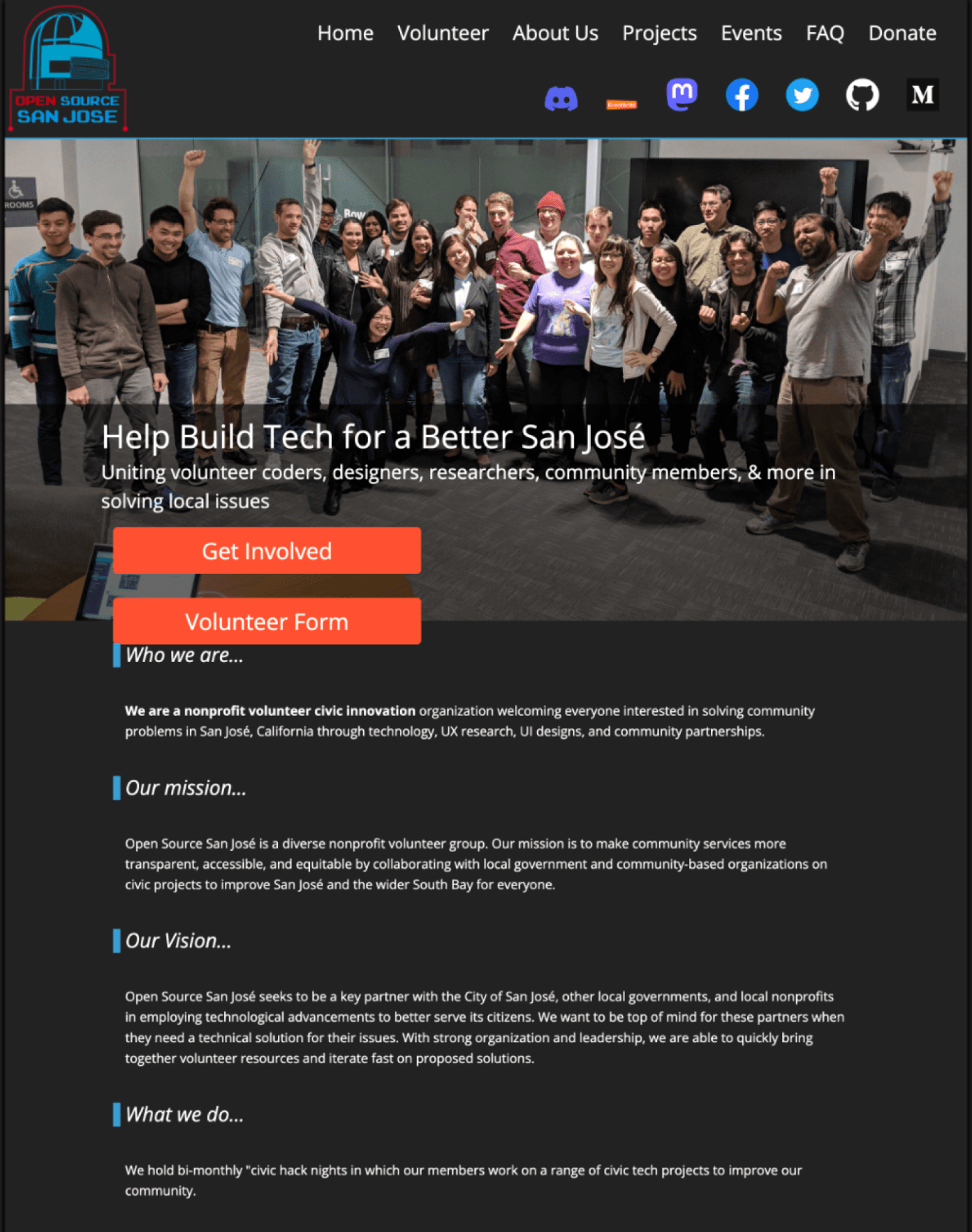
The original homepage contained organizational information, projects, sponsorship, participation, and location content with limited hierarchy and strong competition for attention.
How can the homepage explain OSSJ’s mission and make participation easier to find?
01
COMPETING CTAs
02
DENSE CONTENT BLOCKS
03
WEAK SECTION HIERARCHY

03 / DESIGN GOALS
What needed to improve
01 - SIMPLIFY SCANNING
Make the long homepage easier to process section by section.
02 - CREATE VISUAL HIERARCHY
Differentiate headings, supporting copy, imagery, cards, and CTAs.
03 - CLARIFY PARTICIPATION
Make OSSJ's mission, projects, and ways to get involved easier to identify.
04 / WIREFRAME
Restructuring the homepage hierarchy
The original section order was preserved, but section scale, spacing, grouping, and visual hierarchy were reworked so each content area could be processed more independently.

05 / DESIGN DECISION
Establishing a clearer visual hierarchy
Problem
Many elements on the original homepage competed at similar visual weight.
Decision
Increase contrast between headings, body content, imagery, cards, and calls to action.
Rationale
Visitors should understand the purpose of each section before deciding whether to continue.
Result
A clearer reading path from the hero through organizational information to participation.


06 / DESIGN DECISION
Creating consistent content sections


9:41
Problem
The long homepage lacked a predictable visual rhythm.
Decision
Use consistent section spacing, image placement, and repeated card patterns.
Rationale
Repeating patterns lowers the amount of interpretation needed while scrolling.
Result
Repeated section patterns create a more consistent page structure.
07 / DESIGN DECISION
Making participation easier to find
Problem
Organizational information and participation opportunities competed for attention.
Decision
Make Get Involved and Our Work distinct with prominent calls to action.
Rationale
Visitors should move naturally from understanding OSSJ to seeing how they can participate.
Result
Clearer transitions from understanding OSSJ to exploring active projects and getting involved.


9:41
08 / RESPONSIVE + ACCESSIBILITY CONSIDERATIONS
Maintaining clarity across screen sizes
READABLE HIERARCHY
Clear heading scale, body text size, and spacing between groups make content easier to process at a glance.
CONTRAST
Distinct heading, body, and button styles establish hierarchy across the teal and light sections.
CONTENT GROUPING
Consistent section grouping and spacing create a predictable scroll pattern from desktop to mobile.
RECOGNIZABLE CTAs
Repeated card and button patterns make interactive elements easier to identify as the layout reflows across breakpoints.


9:41
09 / FINAL HOMEPAGE
A clearer path from understanding to participation
01 - UNDERSTAND
Hero and Who We Are: introduce OSSJ and its mission.


9:41
02 - LEARN
Vision and What We Do: explain the organization.

9:41
03 - ACT
Get Involved and Our Work: show participation opportunities.


9:41
10 / OUTCOME
The redesign transformed a dense, visually competing homepage into a more structured experience with clearer hierarchy, consistent section patterns, and stronger paths to participation.
11 / REFLECTION
This project reinforced the value of clear hierarchy, consistent sections, and visible calls to action before adding more interface features.
12 / NEXT
Next Case Study
SPIN
A resource hub for families
A Squarespace redesign focused on resource categories, navigation, and responsive layouts.
View Case Study →
01 / HOMEPAGE REDESIGN
Open Source San Jose
Redesigning a dense civic-tech homepage into a clearer, more scannable path from mission to participation.
ROLE
UX/UI Design
TOOLS
Figma
SCOPE
Homepage redesign assessment

9:41
02 / AUDIT
Understanding the existing homepage
The original homepage contained organizational information, projects, sponsorship, participation, and location content with limited hierarchy and strong competition for attention.
How can the homepage explain OSSJ’s mission and make participation easier to find?
01
COMPETING CTAs
02
DENSE CONTENT BLOCKS
03
WEAK SECTION HIERARCHY
03 / DESIGN GOALS
What needed to improve
01 - SIMPLIFY SCANNING
Make the long homepage easier to process section by section.
02 - CREATE VISUAL HIERARCHY
Differentiate headings, supporting copy, imagery, cards, and CTAs.
03 - CLARIFY PARTICIPATION
Make OSSJ’s mission, projects, and ways to get involved easier to identify.
04 / WIREFRAME
Restructuring the homepage hierarchy
The original section order was preserved, but section scale, spacing, grouping, and visual hierarchy were reworked so each content area could be processed more independently.
05 / DESIGN DECISION
Establishing a clearer visual hierarchy
Problem
Many elements on the original homepage competed at similar visual weight.
Decision
Increase contrast between headings, body content, imagery, cards, and calls to action.
Rationale
Visitors should understand the purpose of each section before deciding whether to continue.
Result
A clearer reading path from the hero through organizational information to participation.


06 / DESIGN DECISION
Creating consistent content sections
Problem
The long homepage lacked a predictable visual rhythm.
Decision
Use consistent section spacing, image placement, and repeated card patterns.
Rationale
Repeating patterns lowers the amount of interpretation needed while scrolling.
Result
Repeated section patterns create a more consistent page structure.

9:41
07 / DESIGN DECISION
Making participation easier to find
Problem
Organizational information and participation opportunities competed for attention.
Decision
Make Get Involved and Our Work distinct sections with prominent calls to action.
Rationale
Visitors should move naturally from understanding OSSJ to seeing how they can participate.
Result
Clearer transitions from understanding OSSJ to exploring active projects and getting involved.


9:41
08 / RESPONSIVE + ACCESSIBILITY CONSIDERATIONS
Maintaining clarity across screen sizes
READABLE HIERARCHY
Clear heading scale, body text size, and spacing between groups make content easier to process at a glance.
CONTRAST
Distinct heading, body, and button styles establish hierarchy across the teal and light sections.
CONTENT GROUPING
Consistent section grouping and spacing create a predictable scroll pattern from desktop to mobile.
RECOGNIZABLE CTAs
Repeated card and button patterns make interactive elements easier to identify as the layout reflows across breakpoints.

9:41
09 / FINAL HOMEPAGE
A clearer path from understanding to participation
01 - UNDERSTAND
Hero and Who We Are: introduce OSSJ and its mission.


9:41
02 - LEARN
Who We Are, Mission, Vision and What We Do: explain the organization.


9:41
03 - ACT
Get Involved and Our Work: show participation opportunities.


9:41
10 / OUTCOME
The redesign transformed a dense, visually competing homepage into a more structured experience with clearer hierarchy, consistent section patterns, and stronger paths to participation.
11 / REFLECTION
This project reinforced the value of clear hierarchy, consistent sections, and visible calls to action before adding more interface features.
12 / NEXT
Next Case Study
SPIN
A resource hub for families
A Squarespace redesign focused on resource categories, navigation, and responsive layouts.
View Case Study →